
All websites built in 2019 should be mobile responsive.
Meaning your website adapts and looks good on any size screen from a huge computer monitor to mobile phone. It also means that it will look different on each screen. Mobile responsiveness is the expectation from the general public, and most importantly, your potential clients. The statistics only back it up.
80% of smartphone users are more likely to purchase from companies whose mobile sites or apps help them easily find answers to questions. We all want answers to our questions and websites are meant to help give us the answers we are looking for. Having a website that is not mobile responsive has serious consequences.
53% of mobile website visits are abandoned if a mobile site takes longer than three seconds to load. It’s like meeting a person for the first time. We tend to make simple assumptions about people within seconds of meeting them. It’s the same with websites. Your website is the “person” of the internet, your brand ambassador so to speak.
Although mobile websites should be meeting these standards, many are not. According to a Google report, the average mobile webpage takes 15.3 seconds to load.
On the internet, that is an astronomically long time!
Making the customer wait dilutes the user experience and often forces them to find a product or service elsewhere. To make matters worse, 62% of people who have a negative experience on mobile are less likely to purchase from you in the future.
Mobile users are goal-oriented. They expect to be able to get what they need quickly and in the way that they want it. To achieve this, it is important to follow mobile site design principles.
Here are the top 5 Mobile Site Design Principles
- Calls to action are front and center
- Keep menus short and sweet
- Easy to get back to the home page
- Encourage users to explore
- Keep users in a single browser window
I was recently talking to a new business friend and he had purchased a new website package from a telephone company. At the time, he didn’t know me and he didn’t know of my services so he couldn’t hire me. He asked if I would give him some feedback on his contract with the company.
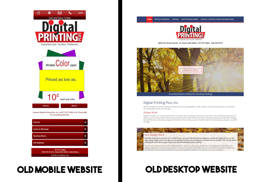
The first thing I noticed was the new website was going to be mobile friendly. His past website had been built at a time when you would actually have two versions of your website built. One that was for mobile devices and one that was for computers. The computer version looked good and had a decent layout. The mobile version followed some of the design principles, but looked like a completely different site and at times felt confusing to navigate. The branding got lost from the mobile version to the computer version.
His new website contract meets his needs, follows the mobile site design principles, and maintains consistent branding to have a good website in 2019. If the website wasn’t going to be mobile friendly, I would have encouraged him to renegotiate the contract since he is not able to get out of it.
Mobile sites are standard, not optional anymore. Now, take a moment to look up your website. Does your website adjust to different screens properly? Does it have consistent branding across different devices? Does it follow the top 5 Mobile Site Design Principles?
If not, I highly encourage you to reach out and give me a call or email so I can help get your website back on track and engaging your customers again.
– JoyGenea
SOURCES:
Statistics from: Aumcore